


Button
Button Attributes Inspector Reference

Type

Type
The button type, which determines its functionality.
Selection |
Method |
Argument |
|---|---|---|
Custom |
||
Rounded Rect |
||
Detail Disclosure |
||
Info Light |
||
Info Dark |
||
Add Contact |
Appearance
This group specifies the appearance of the button in each of its possible states.
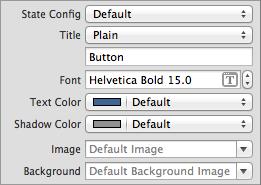
State Config
The button state to configure.
Choose a state, and then configure the remaining properties in this group. The settings are applied to those properties when the button goes to that state.
Selection |
Method |
Argument |
|---|---|---|
Default |
||
Highlighted |
||
Selected |
||
Disabled |
Image
The image for the button when it is in the state identified by State Config.
Access: imageForState:, setImage:forState:.
Background
The background image for the button when it is in the state identified by State Config.
Access: backgroundImageForState:, setBackgroundImage:forState:.
Title
Title Type
The type of text to use for the button title when the button is in the state identified by State Config.
Selection |
|---|
Plain |
Attributed |
Title Type: Plain
These are the properties you can configure for plain text titles in the state identified by State Config.
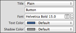
Text
The plain text for the button title in the state identified by State Config.
Access: titleForState:, setTitle:forState:.
Font
The font for the button plain text title in the state identified by State Config.
Use <button>.titleLabel.font to access the value of this property.
Text Color
The color for the button plain text title in the state identified by State Config.
Access: titleColorForState:, setTitleColor:forState:.
Shadow Color
The color for the button plain text title in the state identified by State Config.
Access: titleShadowColorForState:, setTitleShadowColor:forState:.
Title Type: Attributed
These are the properties you can configure for attributed text titles in the state identified by State Config.
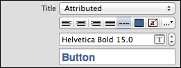
Attributed Title Layout
The alignment and other layout characteristics for the button attributed text title in the state identified by State Config.
You can set these layout characteristics: alignment (left, center, right, justified, and natural), text color, background color, text direction, line breaking, line height and spacing, paragraph spacing, indentation, hyphenation, truncation, and header level).
Selection |
|---|
|
|
|
|
|
|
|
|
 Left
Left
 Center
 Right
Right
 Justified
 Natural
 Text Color
 Background Color
 More
More
Font
The font for the button attributed text title in the state identified by State Config.
Access: button.titleLabel.font.
Attributed Text
The attributed text for the button title in the state identified by State Config.
Access: attributedTitleForState:.
Behavior
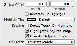
Highlight Tint
The color for the button tint.
Line Break
The line break mode for the button title.
Selection |
Method |
Argument |
|---|---|---|
Clip |
||
Character Wrap |
||
Word Wrap |
||
Truncate Head |
||
Truncate Middle |
||
Truncate Tail |
Shadow Offset
Offset Size
The width and height of the shadow of the button title.
Access: titleShadowOffset.
Reverses On Highlight
Whether the shadow of the button title changes when the button state changes to or from highlighted.
Selection |
Method |
Argument |
|---|---|---|
|
||
|
 Unselected
 Selected
Drawing
Shows Touch On Highlight
Whether the button glows when it is tapped.
Selection |
Method |
Argument |
|---|---|---|
|
||
|
Highlighted Adjusts Image
Whether the button image changes when the button state changes to or from highlighted.
Selection |
Method |
Argument |
|---|---|---|
|
||
|
Disabled Adjusts Image
Whether the button image changes when the button state changes to or from disabled.
Selection |
Method |
Argument |
|---|---|---|
|
||
|
Edge Insets
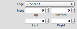
Edge insets resize and reposition the effective drawing rectangle for the button’s entire content, its title, and its image.
Edge
The button edge to configure.
Selection |
|---|
Content |
Title |
Image |
Inset
The inset or outset margins of the rectangle identified by the Edge property.
You can specify a value for each the edges (top, left, bottom, right). A positive value shrinks (or insets) the corresponding edge, moving it closer to the center of the button. A negative value expands (or outsets) the corresponding edge.
Access: contentEdgeInsets, titleEdgeInsets, imageEdgeInsets.
Copyright © 2014 Apple Inc. All rights reserved. Terms of Use | Privacy Policy | Updated: 2013-12-16