Segmented Controls
A segmented control is a horizontal control made of multiple segments, each segment functioning as a discrete button.

Purpose. Segmented controls allow users to:
Interact with a compact group of a number of controls
Implementation. Segmented controls are implemented in the UISegmentedControl class and discussed in the UISegmentedControl Class Reference.
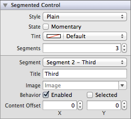
Configuration. Configure segmented controls in Interface Builder, in the Segmented Control section of the Attributes Inspector. A few configurations cannot be made through the Attributes Inspector, so you must make them programmatically. You can set other configurations programmatically, too, if you prefer.

Content of Segmented Controls
Segmented controls are made up of a number of individual buttons called segments. You can choose the number of segments by setting the Segments (numberOfSegments) field. By default, a segmented control is created with two segments.

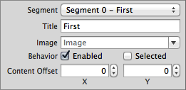
Content for each segment is set individually. Using the Segment field, you can select a particular segment to modify its content. A segment may either have a text title or an image, but not both. Use the Title (titleForSegmentAtIndex:) or Image (imageForSegmentAtIndex:) fields to set one of these content properties. As stated in the HI guidelines, avoid creating a segmented control with some segments that contain text and others that images; just choose one or the other.

Behavior of Segmented Controls
Segmented controls do not need a delegate to function properly; their parent view controller can define their behavior without implementing any delegate protocols.
A segmented control sends the UIControlEventValueChanged event when the user presses one of the segments. You can respond to this event by performing some corresponding action in your app, such as switching to a different layout. You register the target-action methods for a segmented control as shown below.
[self.mySegmentedControl addTarget:selfaction:@selector(myAction:)forControlEvents:UIControlEventValueChanged];
Alternatively, you can Control-drag the segmented control’s Value Changed event from the Connections Inspector to the action method. For more information, see Target-Action Mechanism.
If you set a segmented control to have a momentary selection style, its segments do not stay in a selected state when pressed. Instead, they are momentarily highlighted and then restored back to the normal control state. If you would like to enable this behavior, select the Momentary (momentary) checkbox in the Attributes Inspector. Note that setting the momentary selection behavior affects every segment in a segmented control; you cannot have a control with some momentary segments and some regular segments.

You can specify whether a given segment is enabled or disabled. A user cannot interact with a segment that is disabled. Use the Enabled (isEnabledForSegmentAtIndex:) checkbox to specify whether a given segment is enabled for user interaction. Additionally, you can specify whether a particular segment is currently selected using the Selected (selectedSegmentIndex) checkbox. Note that only one segment can be selected at a time; if you set the selection for a given segment, the previously selected segment will become unselected.

Appearance of Segmented Controls
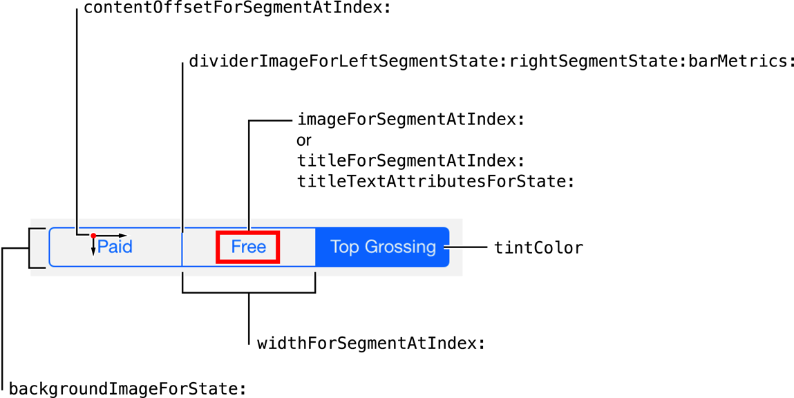
You can customize the appearance of a segmented control by setting the properties depicted below.

To customize the appearance of all segmented controls in your app, use the appearance proxy (for example, [UISegmentedControl appearance]). For more information about appearance proxies, see Appearance Proxies.
Tint Color
Specify a custom segmented control tint using the Tint (tintColor) field. This property sets the color of the segment images, text, dividers, borders, and selected segment. A translucent version of this color is also used to tint a segment when it is pressed and transitioning to being selected, as shown on the first segment below.

If you do not explicitly set a tint color, the segmented control will inherit its superview’s tint color. For more information, see Tint Color.

Style
You cannot customize the segmented control’s style on iOS 7. Segmented controls only have one style, and the Style (segmentedControlStyle) field has been deprecated.
Content Offset
If you want the content of a particular segment to be offset from its default position, you can alter it using the Content Offset fields in Attributes Inspector.

Images
If you need to customize the appearance of your segmented control beyond standard tinting, you might consider doing so using custom images. Since segmented controls have different metrics for portrait and landscape device orientations, remember to specify an appropriate image for each set of metrics.
You can set a background image for each control state of your segmented control using the backgroundImageForState:barMetrics: method. You should also specify divider images for each combination of left and right segment states to give selected or highlighted segments a different look than segments in a normal state, as shown here:
[mySegmentedControl setDividerImage:image1 forLeftSegmentState:UIControlStateNormal rightSegmentState:UIControlStateNormal barMetrics:barMetrics];[mySegmentedControl setDividerImage:image2 forLeftSegmentState:UIControlStateSelected rightSegmentState:UIControlStateNormal barMetrics:barMetrics];[mySegmentedControl setDividerImage:image3 forLeftSegmentState:UIControlStateNormal rightSegmentState:UIControlStateSelected barMetrics:barMetrics];
Title Attributes
The titleTextAttributesForState: property specifies the attributes for displaying the segment’s title text. You can specify the font, text color, text shadow color, and text shadow offset for the title in the text attributes dictionary, using the text attribute keys described in NSString UIKit Additions Reference.
Segment Icons
You can use an image instead of title text for your segments. Note that a segment image will be automatically rendered as a template image within a segmented control, unless you explicitly set its rendering mode to UIImageRenderingModeAlwaysOriginal. For more information, see Template Images.
Using Auto Layout with Segmented Controls
You can create auto layout constraints between a segmented control and other user interface elements. You can create any type of constraint for a segmented control.
For general information about using auto layout with iOS controls, see Using Auto Layout with Controls.
Making Segmented Controls Accessible
The following listing demonstrates how you can set the accessibility label of programmatically-generated segments.
NSString *title = @"∫";title.accessibilityLabel = @"Integral";[segmentedControl insertedSegmentedWithTitle:title];UIImage *image = [UIImage imageNamed:@"GearImage.png"];image.accessibilityLabel = @"Settings";[segmentedControl insertedSegmentWithImage:image];
For general information about making iOS controls accessible, see Making Controls Accessible.
Internationalizing Segmented Controls
To internationalize a segmented control, you must provide localized strings for all segment titles. Remember to test all localizations, as segment size may change unexpectedly when using localized strings.
For more information, see Internationalization Programming Topics.
Debugging Segmented Controls
When debugging issues with segmented controls, watch for these common pitfalls:
Specifying conflicting appearance settings. When customizing segment content with text or images, use one or the other, but not both. A segment cannot have both text and an image as its content. Whichever content property was set last will override the other one.
Not setting custom images for every control state. If you use custom background and divider images for your segmented control, remember to set an image for every possible
UIControlStatecombination. Any control state that does not have a corresponding custom image assigned to it will display the standard image instead. If you set one custom image, make sure to set them all.
Elements Similar to a Segmented Control
The following elements provide similar functionality to a segmented control:
Tab Bar. A class used for navigating between views in an app. You should use a tab bar instead of a segmented control when you want to let the user move back and forth between distinct pages in your app. For more information, see Tab Bars.
Toolbar. A class that allows users to perform certain actions in the current context. For more information, see Toolbars.
Copyright © 2014 Apple Inc. All rights reserved. Terms of Use | Privacy Policy | Updated: 2013-12-16


