Segmented Control
Segmented Control Attributes Inspector Reference

Appearance and Behavior
This group specifies the appearance and behavior for the segmented control.

Style
The basic appearance of the segmented control.
Selection |
Method |
Argument |
|---|---|---|
Plain |
||
Bordered |
||
Bar |
Tint
The color of the segmented control.
Segments
The number of segments in the segmented control.
Access: numberOfSegments.
State
Momentary
Whether the segmented control segments are only momentarily selected.
A segmented control selection behavior can be normal or momentary.
Normal selection. When the user taps a segment, the segment becomes selected (the segmented control
selectedSegmentIndexis set to that segment’s index).Momentary selection. When the user taps a segment, the segment does not become selected, but the segment appears selected while the user holds it.
Segment Appearance and Behavior
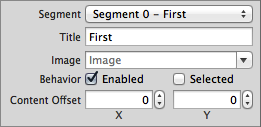
This group specifies the appearance and behavior for each of the segmented control segments.

Segment
The segment to configure.
Choose a segment, and then configure the properties in this group.
Title
The title of the segment identified by Segment.
Access: setTitle:forSegmentAtIndex:.
Image
The image of the segment identified by Segment.
Access: setImage:forSegmentAtIndex:.
Content Offset
The offset from the segment origin at which to draw the content of the segment identified by Segment.
Access: setContentOffset:forSegmentAtIndex:.
Behavior
Enabled
Whether segment identified by Segment is enabled.
Selection |
Method |
Argument |
|---|---|---|
|
||
|
Selected
Whether segment identified by Segment is selected.
Use selectedSegmentIndex to select a segment.
Selection |
|---|
|
|
Copyright © 2014 Apple Inc. All rights reserved. Terms of Use | Privacy Policy | Updated: 2013-12-16


