Buttons
Buttons let a user initiate behavior with a tap. You communicate a button’s function through a textual label or with an image. Your app changes button appearance based upon user touch interactions, using highlighting, changes in the label or image, color, and state to indicate the button action dynamically.

Purpose. Buttons allow users to:
Initiate behavior with a tap
Initiate an action in the app with a single simple gesture
Implementation. Buttons are implemented in the UIButton class and discussed in the UIButton Class Reference.
Configuration. Configure buttons in Interface Builder, in the Button section of the Attributes Inspector. A few configurations cannot be made through the Attributes Inspector, so you must make them programmatically. You can set other configurations programmatically, too, if you prefer.
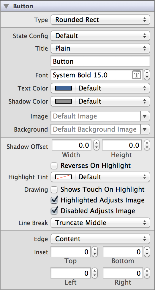
Content of Buttons
Set a button’s content using the Type (buttonType) field in the Attributes Inspector. In iOS 7, the rounded rect button type has been deprecated in favor of the system button, UIButtonTypeSystem. Button objects can be specified as one of five standard types—system, detail disclosure, info light, info dark, and add contact. The detail disclosure, info, and add contact button types are supplied with standard image graphics to indicate their purpose to the user. These images cannot be customized.
There is also a custom type for great versatility in defining a unique interface.
Behavior of Buttons
Buttons do not need a delegate to function properly; a view controller can define their behavior and functionality without implementing any delegate protocols.
A button sends the UIControlEventTouchUpInside event when the user taps it. You can respond to this event by performing some corresponding action in your app, such as saving information. You register the target-action methods for a button as shown below.
[self.myButton addTarget:selfaction:@selector(myAction:)forControlEvents:UIControlEventValueChanged];
Alternatively, you can Control-drag the button’s Value Changed event from the Connections Inspector to the action method. For more information, see Target-Action Mechanism.
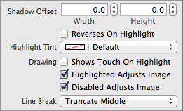
If the Shows Touch On Highlight (showsTouchWhenHighlighted) box is enabled, when a user presses on the button, there will be a white glow where the touch event occurred on the button.
If your button has a custom image, the Highlighted Adjusts Image (adjustsImageWhenHighlighted) and Disabled Adjusts Image (adjustsImageWhenDisabled) options allow you to specify whether highlighted or disabled states affect the appearance of the image. For example, with those options enabled, the image might get darker when the button is highlighted, and dimmer when the button is disabled.
If your button content extends past the bounds of the button, you can specify which part of the content to truncate using the Line Break (lineBreakMode) field.
Appearance of Buttons
You can customize the appearance of a button by setting the properties depicted below.

To customize the appearance of all buttons in your app, use the appearance proxy (for example, [UIButton appearance]). For more information about appearance proxies, see Appearance Proxies.
State
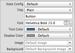
A button has four states to configure for appearance—default, highlighted, selected, and disabled. To configure the button’s appearance for each state, first select the state from the State Config menu in the Attributes Inspector and then use the other menus and text boxes in the Attributes Inspector’s appearance property group.
Shadow
Shadow offset defines how far the shadow is drawn from the button text. You can customize the offset for both dimensions using the Shadow Offset (titleShadowOffset) fields.

You can select the Reverses On Highlight (reversesTitleShadowWhenHighlighted) checkbox if you want your shadow offset to automatically flip directions when the button is in the UIControlStateHighlighted state.

Tint Color
You can specify a custom button tint using the tintColor property. This property sets the color of the button image and text.
If you do not explicitly set a tint color, the button will inherit its superview’s tint color. For more information, see Tint Color.
Title Attributes
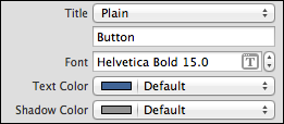
Button can have one of two types of text: plain or attributed. Plain text supports a single set of formatting attributes—font, size, color, and so on—for the entire string. On the other hand, attributed text supports multiple sets of attributes that apply to individual characters or ranges of characters in the string.
The default title is “Button”, intended to be altered to the app need. The title string set in the default state is used in all other states unless you enter a replacement title string for a specific state. Available title customization options differ depending on whether you are using plain or attributed text:

Images
Using the Image (currentImage) field, you can specify an image to appear within the content of your button. If the button has a title, this image appears to the left of it, and centered otherwise. The image does not stretch or condense, so make sure to select an image that is the proper size to appear in your button. Note that this image will be automatically rendered as a template image within the button, unless you explicitly set its rendering mode to UIImageRenderingModeAlwaysOriginal. For more information, see Template Images.
The Background (currentBackgroundImage) field allows you to specify an image to appear behind button content and fill the entire frame of the button. The image you specify will stretch to fill the button if it is too small. It will be cropped if it is too large.
The images set in the default state are used in all other states unless you enter a replacement image for a specific state.

Edge Insets
The part of your button that makes up your image and text is your content. You can offset this content by using edge insets. In the Edge field, select whether you want to offset just your title, just your image, or both together. Depending on your selection, the changes you make to the Inset fields will adjust the titleEdgeInsets, imageEdgeInsets, and contentEdgeInsets properties, respectively.
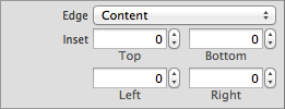
There should be no reason for you to adjust the edge insets for info, contact, or disclosure buttons. This functionality is intended for custom or rounded rectangle buttons only.
Using Auto Layout with Buttons
You can create Auto Layout constraints between a button and other user interface elements. You can create any type of constraint for a button.
For general information about using Auto Layout with iOS controls, see Using Auto Layout with Controls.
Making Buttons Accessible
Buttons are accessible by default. The default accessibility traits for a button are Button and User Interaction Enabled.
The accessibility label, traits, and hint are spoken back to the user when VoiceOver is enabled on a device. The button’s title overwrites its accessibility label; even if you set a custom value for the label, VoiceOver speaks the value of the title. VoiceOver speaks this information when a user taps the button once. For example, when a user taps the Options button in Camera, VoiceOver speaks the following:
"Options. Button. Shows additional camera options."
For general information about making iOS controls accessible, see Making Controls Accessible.
Internationalizing Buttons
To internationalize a button, you must provide localized strings for its title text.
For more information, see Internationalization Programming Topics.
Elements Similar to a Button
The following element provides similar functionality to a button:
Bar Button. An icon used to execute an action from a toolbar or for navigation in a navigation bar. For more information, see Toolbars.
Copyright © 2014 Apple Inc. All rights reserved. Terms of Use | Privacy Policy | Updated: 2013-12-16


