Table Views
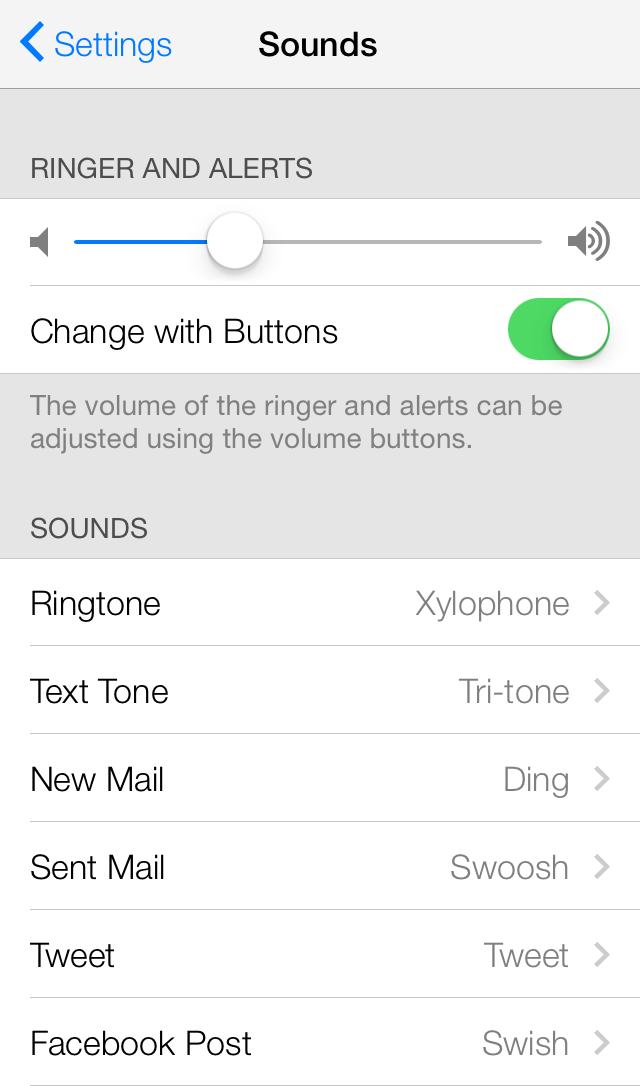
A table view presents data in a scrollable list of multiple rows that may be divided into sections. It presents data in a single-column list of multiple rows and is a means for displaying and editing hierarchical lists of information. For instance, the Mail application uses a table view to display email messages in a user’s inbox. In normal mode, selecting a message allows the user to read it. In editing mode, selecting a message allows the user to delete it from the inbox. Table views provide a simple yet versatile interface for managing and interacting with collections of data.

Purpose. Table views allow users to:
Navigate through hierarchically structured data
View an indexed list of items
See detail information and controls in visually distinct groupings
Interact with a selectable list of options
Implementation.
Table views are implemented in the
UITableViewclass and discussed in UITableView Class Reference.Individual table cells are implemented in the
UITableViewCellclass and discussed in UITableViewCell Class Reference.Table headers and footers are implemented in the
UITableViewHeaderFooterViewclass and discussed in UITableViewHeaderFooterView Class Reference.
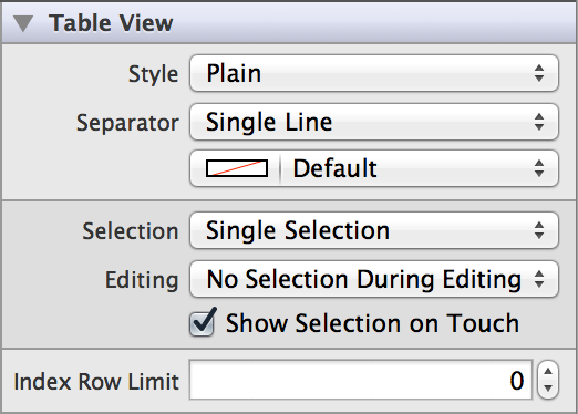
Configuration. Configure table views in Interface Builder, in the Table View section of the Attributes Inspector. A few configurations cannot be made through the Attributes Inspector, so you must make them programmatically. You can set other configurations programmatically, too, if you prefer.


Content of Table Views
To display content, a table view must have a data source. The data source mediates between the app’s data model and the table view. A table view’s data source must conform to the UITableViewDataSource protocol. For more information about the data source, see “Data Source and Delegate” in Table View Programming Guide for iOS.

Each individual table cell can display a variety of content. Cells that use the default basic style can display an image and text label, and cells that use one of the other three standard styles can display an image, text label, and detail text label in a particular pre-defined layout. You can set a cell’s image programmatically using the “Image” (image) field in the Attributes Inspector, which appears when the cell is in one of the four standard styles. However, you must set the textLabel and detailTextLabel properties programmatically. To learn more about table cell content, see “A Closer Look at Table View Cells”.
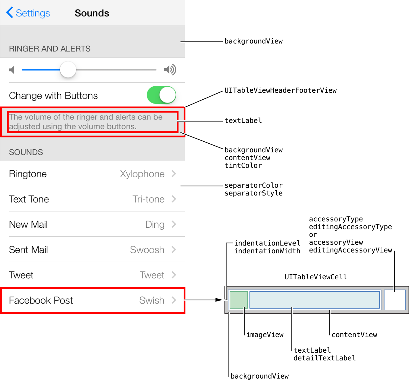
A cell’s content—image, text, and any custom views—resides in its content view. If you want to customize your table cell beyond the standard cell styles, you can set the cell style to custom and add your custom views to the cell’s contentView property programmatically.
Each table—and each section within that table—can have a header and a footer that displays text or custom content. You use headers and footers to display additional information about the table or its sections. The UITableViewHeaderFooterView class implements a reusable view that you can place at the top or bottom of a table or table section.
Headers and footers can either display a text label and optional detail text label, or custom content. You can set the textLabel and detailTextLabel properties programmatically. Alternatively, you can add your custom views to the header or footer’s contentView property programmatically. If you are using any custom content in a header or footer, do not use the standard textLabel and detailTextLabel properties; instead, add your own labels to the content view. For more information about headers and footers, see “Grouped Table Views” in Table View Programming Guide for iOS and UITableViewHeaderFooterView Class Reference.
Behavior of Table Views
Table views need a delegate to manages the appearance and behavior. By assigning a view controller as the table view’s delegate and implementing any or all of the UITableViewDelegate methods, you can allow the delegate to manage selections, configure section headings and footers, help to delete and reorder cells, and perform other actions.

Table selection style controls the number of cells a user can select at a given time. There are three types of selection available for individual cells in a table view: single, multiple, or none. Tables can have different types of selection in normal mode and editing mode. For example, you can allow users to select multiple items in normal mode, but only delete one item at a time in editing mode. In Interface Builder, you can specify selection style for normal mode using the Selection field, and for editing mode using the Editing field. You can also choose whether a cell is visually highlighted upon selection by checking the Show Selection on Touch box.

Index Row Limit (sectionIndexMinimumDisplayRowCount) allows you to specify the minimum number of rows required in the table for the index to be shown. Note that this applies to plain style tables only.

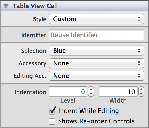
A reuse identifier is a string used to identify a cell that can be reused for multiple rows of a table view (for performance purposes). You can set this property using the Identifier (reuseIdentifier) field in the Attributes Inspector. You can also set a reuse identifier programmatically during cell initialization.

You can set indentation values for cell content through the Level (indentationLevel) and Width (indentationWidth) fields. The width is the value for each level of indentation. You can indicate whether to indent cell content in editing mode by checking the Indent While Editing (shouldIndentWhileEditing) box.
Checking the Shows Re-order Controls (showsReorderControl) box will cause the cell to display a control that allows it to be reordered within the table in editing mode. However, you must also implement the UITableViewDataSource method tableView:moveRowAtIndexPath:toIndexPath: and set tableView:canMoveRowAtIndexPath: to return YES to get the reordering control to appear in a particular cell. This part must be done programmatically.
To make the table view aware of a header or footer view, you need to register it. You do this using the registerNib:forCellReuseIdentifier: or registerClass:forCellReuseIdentifier: method. Similar to that of a table cell, the header or footer’s reuse identifier is a string used to identify a header or footer view that can be reused for multiple headers or footers within a table. It is set during initialization using the initWithReuseIdentifier: method.
Appearance of Table Views
You can customize the appearance of a table view by setting the properties depicted below.

To customize the appearance of all table views in your app, use the appearance proxy (for example, [UITableView appearance]). For more information about appearance proxies, see Appearance Proxies.
Style

Separator style dictates how a table’s cells are separated visually. You can customize the style and color of table cell separators using the Separator (separatorStyle, separatorColor) fields in the Attributes Inspector. There are three available styles: single line, etched line, or none.
Table style affects the appearance of a table’s sections. Tables have two styles: plain and grouped. Certain appearance properties only apply when a table view is displayed in one particular style. You can select the style of a table to be plain or grouped using the Style (style) attribute.
Cell Selection Style

Cell selection style specifies which color the outline of a selected cell will appear: gray, blue, or none. Use the Selection (selectionStyle) field to set cell selection style.
Accessory Types

You can also set accessory types for normal and editing modes through the Accessory (accessoryType) and Editing Acc. (editingAccessoryType) fields in the Attributes Inspector. For a list of standard accessory types, see Cell Accessory Type.
Alternatively, you can use custom views by setting the accessoryView and editingAccessoryView properties programmatically. Custom views have precedence over the standard accessory types, so if you set the accessory view properties, your cell ignores the value of the accessoryType and editingAccessoryType properties.
Cell Layout

The cell style attribute determines how content is visually laid out in a cell. You can select one of four existing styles—or create a custom one—in the Style field of a table cell’s Attributes Inspector.
Header and Footer Appearance
You can customize the appearance of your header or footer by setting a custom background view or tint color. The background view is placed behind the contentView and used to display static background content behind the header or footer. For example, you might assign an image view to this property and use it to display a custom background image. Alternatively, you can set a custom tint for the header or footer view by setting its tintColor property. Avoid setting both a custom background view and a custom tint.
Using Auto Layout with Table Views
You can create Auto Layout constraints between a table view and other user interface elements. You can create any type of constraint for a table view besides a baseline constraint.
For general information about using Auto Layout with iOS views, see Using Auto Layout with Views.
Making Table Views Accessible
Table views are accessible by default. Accessibility for tables is handled at the table cell level.
For general information about making iOS views accessible, see Making Views Accessible.
Internationalizing Table Views
To internationalize a table view, you must provide localized strings for text labels and detail text labels of all table cells, headers, and footers.
For more information, see Internationalization Programming Topics.
Elements Similar to a Table View
The following element provides similar functionality to a table view:
Scroll View. A class that provides support for displaying content that is larger than the size of the app’s window. Use this class when your app contains too much information to display on an iOS device screen at one time. For more information, see Scroll Views.
Copyright © 2014 Apple Inc. All rights reserved. Terms of Use | Privacy Policy | Updated: 2013-12-16


