Scroll Views
A scroll view allows users to see content that is larger than the scroll view’s boundaries. When a scroll view first appears—or when users interact with it—vertical or horizontal scroll indicators flash briefly to show users that there is more content they can reveal. Other than the transient scroll indicators, a scroll view has no predefined appearance.

Purpose. Scroll views allow users to:
View content that does not fit on the screen of the device
Implementation. Scroll views are implemented in the UIScrollView class and discussed in the UIScrollView Class Reference
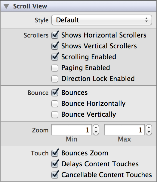
Configuration. Configure scroll views in Interface Builder, in the Scroll View section of the Attributes Inspector. A few configurations cannot be made through the Attributes Inspector, so you must make them programmatically. You can set other configurations programmatically, too, if you prefer.

Content of Scroll Views
Set scroll view content programmatically by adding subviews to its content view with the addSubview: method.
Behavior of Scroll Views
Scroll views need a delegate to handle scrolling, dragging, and zooming. By assigning a view controller as the scroll view’s delegate and implementing any or all of the UIScrollViewDelegate methods, you can define these behaviors.
A scroll view responds to the speed and direction of gestures to reveal content in a way that feels natural to people. When users drag content in a scroll view, the content follows the touch; when users flick content, the scroll view reveals the content quickly and stops scrolling when the user touches the screen or when the end of the content is reached. A scroll view can also operate in paging mode, in which each drag or flick gesture reveals one app-defined page of content.

Use the Shows Horizontal Scrollers (showsHorizontalScrollIndicator) and Shows Vertical Scrollers (showsVerticalScrollIndicator) boxes to specify whether the corresponding scroll indicator should be visible during tracking and fades out after tracking. These options are enabled by default; toggle off is you do not want the scroller to be shown.
You can specify whether scrolling is enabled or disabled in the scroll view using the Scrolling Enabled (scrollEnabled) checkbox. Scrolling is enabled by default. When scrolling is disabled, the scroll view does not accept touch events; it forwards them up the responder chain.
If you check the Paging Enabled (pagingEnabled) box, the the scroll view stops on multiples of the scroll view’s bounds when the user scrolls, giving the effect of scrolling through a single page at a time.
If you turn on directional lock by checking the Direction Lock Enabled (directionalLockEnabled) box, a user will only be able to scroll in one direction at a time. By default, a user can scroll in both directions, or diagonally.

If the Bounces Zoom (bouncesZoom) option is enabled, when zooming exceeds either the maximum or minimum limits for scaling, the scroll view temporarily animates the content scaling just past these limits before returning to them. If this option is disabled, zooming stops immediately at one a scaling limits.
Using the Delays Content Touches (delaysContentTouches) checkbox, you can specify whether the scroll view delays the handling of touch-down gestures. When enabled, the view delays handling the touch-down gesture until it can determine if scrolling is the intent.
You can indicate whether touches in the content view always lead to tracking by using the Cancellable Content Touches (canCancelContentTouches) checkbox. When enabled, if a user drags their finger enough to initiate a scroll within a view in the content that has begun tracking a finger touching it, that view receives a touchesCancelled:withEvent: message and the scroll view handles the touch as a scroll. When disabled, the scroll view does not scroll regardless of finger movement once the content view starts tracking.

Use the Bounces (bounces) checkbox to indicate whether the scroll view bounces past the edge of content and back again. Enable Bounce Horizontally (alwaysBounceHorizontal) if you want content to bounce when scrolled horizontally, and Bounce Vertically (alwaysBounceVertical) if you want content to bounce when scrolled vertically.

You can use the Min Zoom (minimumZoomScale) and Max Zoom (maximumZoomScale) fields to specify how much the scroll view’s content can be zoomed. The maximum zoom scale must be greater than the minimum zoom scale for zooming to be enabled. The default value is 1.0.
Appearance of Scroll Views
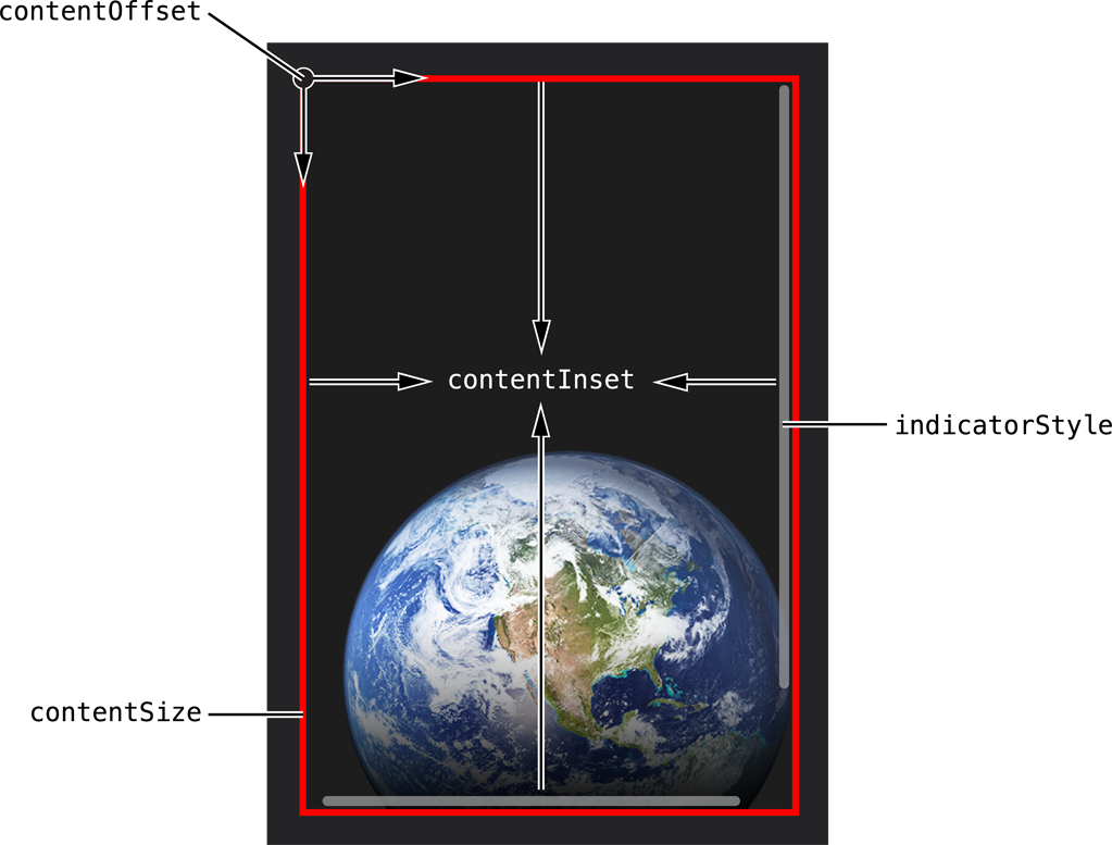
You can customize the appearance of a scroll view by setting the properties depicted below.

To customize the appearance of all scroll views in your app, use the appearance proxy (for example, [UIScrollView appearance]). For more information about appearance proxies, see Appearance Proxies.
Style
The only way to customize the appearance of a scroll view is by setting the style of the scroll indicators. There are three different choices for indicator style: default (black with a white border), white, or black. You can set the indicator style using the “Style” (indicatorStyle) field in the Attributes Inspector.

Content Layout
Scroll views have a number of options that dictate how their content is laid out. You specify the size of the content using the contentSize property, which is initially set to zero. You can use the contentInset property to specify a content inset, which is the distance that the content is padded or inset from the enclosing scroll view. Additionally, you can use the contentOffset property or the setContentOffset:animated: method to set the point at which the origin of the content view is offset from the origin of the scroll view.
Using Auto Layout with Scroll Views
You can create Auto Layout constraints between a scroll view and other user interface elements. You can create any type of constraint for a scroll view besides a baseline constraint.
For general information about using Auto Layout with iOS views, see Using Auto Layout with Views.
Making Scroll Views Accessible
Scroll views are accessible by default. The default accessibility trait for a scroll view is "User Interaction Enabled.”
For general information about making iOS views accessible, see Making Views Accessible.
Internationalizing Scroll Views
For more information, see Internationalization Programming Topics.
Elements Similar to a Scroll View
The following elements provide similar functionality to a scroll view:
Table View. A scrolling view that displays data items in a single-column list. For more information, see Table Views.
Collection View. A scrollable view that displays an ordered collection of data items using standard or custom layouts. Similar to a table view, a collection view gets data from your custom data source objects and displays it using a combination of cell, layout, and supplementary views. For more information, see Collection Views.
Copyright © 2014 Apple Inc. All rights reserved. Terms of Use | Privacy Policy | Updated: 2013-12-16


