Text Fields
Text fields allows the user to input a single line of text into an app. You typically use text fields to gather small amounts of text from the user and perform some immediate action, such as a search operation, based on that text.

Purpose. Text fields allow users to:
Enter text as input to an app
Implementation. Text fields are implemented in the UITextField class and discussed in the UITextField Class Reference.
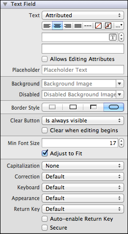
Configuration. Configure text fields in Interface Builder, in the Text Field section of the Attributes Inspector. A few configurations cannot be made through the Attributes Inspector, so you must make them programmatically. You can set other configurations programmatically, too, if you prefer.
Content of Text Fields
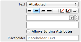
Set the content of the text field using the Text (text) field. You can select whether you want plain or attributed text. The placeholder appears in place whenever a text field has no characters (before a user begins typing, or if the user deletes everything in the text field).
Both placeholder and text can be attributed strings. For information about using attributed text, see Text Attributes.
A user can use the Clear button to delete all text in the text field, and display the placeholder string if one is set. You can specify when the Clear button is displayed to the user using the Clear Button (clearButtonMode) field. Additionally, you can indicate whether the text field should automatically clear itself when the user begins editing it by checking the Clear When Editing Begins (clearsOnBeginEditing) box.

Behavior of Text Fields
Text fields need a delegate to handle any custom behaviors, such as displaying additional overlay views when a user begins editing it. By assigning the parent view controller as the text field’s delegate and implementing any or all of the UITextFieldDelegate methods, you can implement such custom behaviors.
A text field sends the UIControlEventEditingDidBegin, UIControlEventEditingChanged, UIControlEventEditingDidEnd, and UIControlEventEditingDidEndOnExit events when the user edits it. You can respond to these events by performing some corresponding action in your app, such as updating information as the user types it. You register the target-action methods for a text field as shown below.
[self.myTextField addTarget:selfaction:@selector(myAction:)forControlEvents:UIControlEventEditingDidEnd];
Alternatively, you can Control-drag the text field’s Value Changed event from the Connections Inspector to the action method. For more information, see Target-Action Mechanism.
A user types content into a text field using a keyboard, which has a number of customization options:
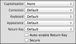
Keyboard layout. The Keyboard field allows you to select from a number of different keyboard layouts. Match the keyboard layout to the purpose of the text field. If the user will be entering a web address, select the URL keyboard. The default keyboard layout is an alphanumeric keyboard in the device’s default language. For a list of possible keyboard types, see
UIKeyboardType. You cannot customize the appearance of the keyboard on iOS 7.Return key. The return key, which appears in the bottom right of the keyboard, allows the user to notify the system when they are finished editing the text field. You can select one of several standard return key types by using the Return Key field. The return key is disabled by default, and only becomes enabled when a user types something into the text field. If you want your user to be able to press the return key any time the keyboard is open, even if the input is empty or incomplete, you can enable the Auto-enable Return Key option. Different return keys are intended to provide the user with an understanding of what action hitting the key will trigger. Note that simply selecting a different return key appearance does not provide you with the functionality intended by that key; you must implement custom return key behavior yourself using the
textFieldShouldReturn:method in your text field’s delegate.Capitalization scheme. The Capitalization field specifies how text should be capitalized in the text field: no capitalization, every word, every sentence, or every character. Although no capitalization is selected by default, you should select the capitalization scheme that reflects the intended use of your text field. For example, if you ask for a user’s full name, you can configure the keyboard to capitalize every word so the user does not have to do it manually.
Auto-correction. The Correction field simply disables or enables auto-correct in the text field.
Secure content. The Secure option is off by default. Enabling it causes the text field to obscure text once it is typed, allowing the user to safely enter secure content—such as a password—into the field.
You can use the text field delegate methods to handle custom keyboard dismissal.
Appearance of Text Fields
You can customize the appearance of a text field by setting the properties depicted below.
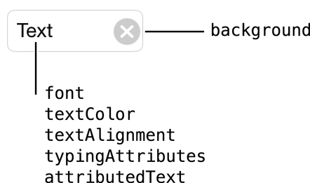
To customize the appearance of all text fields in your app, use the appearance proxy (for example, [UITextField appearance]), or just of a single control. For more information about appearance proxies, see Appearance Proxies.
Border Style

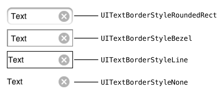
You can select one of the following border styles for your text field by selecting it next to the Border Style (borderStyle) field:
Text Attributes
Text views can have one of two types of text: plain or attributed. Plain text supports a single set of formatting attributes—font, size, color, and so on—for the entire string. On the other hand, attributed text supports multiple sets of attributes that apply to individual characters or ranges of characters in the string.

Font Size
By default, the Adjusts to Fit (adjustsFontSizeToFitWidth) box is selected in the Attributes Inspector. When this option is enabled, the font size of your text label will automatically scale to fit inside the text field. If you anticipate your text label to change—such as if the string is localized—you should keep this selected. Setting a minimum font size ensures that your text will never appear smaller than intended. Use the Min Font Size (minimumFontSize) field if you want to change the value from its default.

Images
A text field can have a background image that sits under the content of the text field. Use the Background (background) field to set a background image for the normal state and the Disabled (disabledBackground) field to set a background image for when the control is disabled.

Using Auto Layout with Text Fields
You can create Auto Layout constraints between a text field and other user interface elements. You can create any type of constraint for a text field.
You will generally need to specify what a text field is intended for. You can use a label to do this. Place the label to the left of the text field and give the label and text field a “Horizontal Spacing” constraint.
For general information about using Auto Layout with iOS controls, see Using Auto Layout with Controls.
Making Text Fields Accessible
Text fields are accessible by default. The default accessibility traits for a text field are User Interaction Enabled and Adjustable.
For general information about making iOS controls accessible, see Making Controls Accessible.
Internationalizing Text Fields
The default language of the device affects the keyboard that pops up with the text field (including the return key). You don’t need to do anything to enable this functionality; it is enabled by default. However, your text field should be able to handle input that comes from any language.
For more information, see Internationalization Programming Topics.
Elements Similar to a Text Field
The following elements provide similar functionality to a text field:
Text View. A text view accepts and displays multiple lines of text. Text views support scrolling and text editing. You typically use a text view to display a large amount of text, such as the body of an email message. For more information, see Text Views.
Label. A label displays static text. Labels are often used in conjunction with controls to describe their intended purpose, such as explaining which value a button or slider affects. For more information, see Labels.
Copyright © 2014 Apple Inc. All rights reserved. Terms of Use | Privacy Policy | Updated: 2013-12-16


