Text Views
A text view accepts and displays multiple lines of text. Text views support scrolling and text editing. You typically use a text view to display a large amount of text, such as the body of an email message.
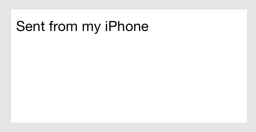
Purpose. Text views allow users to:
Input user content into an app
Implementation. Text views are implemented in the UITextView class and discussed in the UITextView Class Reference.
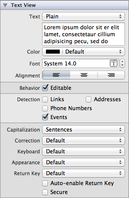
Configuration. Configure text views in Interface Builder, in the Text View section of the Attributes Inspector. A few configurations cannot be made through the Attributes Inspector, so you must make them programmatically. You can set other configurations programmatically, too, if you prefer.
Content of Text Views
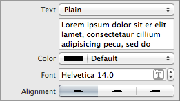
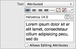
Set text view content using the Text (text and attributedText) field. Both properties get set whether you specified the value of the field to be plain or attributed. Plain text supports a single set of formatting attributes—font, size, color, and so on—for the entire string. On the other hand, attributed text supports multiple sets of attributes that apply to individual characters or ranges of characters in the string.
Behavior of Text Views

By default, users can add, remove, or change text within a text view. To disable these behaviors, uncheck the Editable (editable) checkbox in the Attributes Inspector.

A text view is capable of recognizing when text is formatted as a link, address, phone number, or event. If you enable the corresponding Detection (dataDetectorTypes) checkboxes, users will be able to trigger the appropriate action for each type of text by clicking it in the text view. For example, they will be able to call a phone number or add an event to their calendar.
A user types content into a text view using a keyboard, which has a number of customization options:
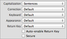
Keyboard layout. The Keyboard field allows you to select from a number of different keyboard layouts. Match the keyboard layout to the purpose of the text view. If the user will be entering a web address, select the URL keyboard. The default keyboard layout is an alphanumeric keyboard in the device’s default language. For a list of possible keyboard types, see
UIKeyboardType. You cannot customize the appearance of the keyboard on iOS 7.Return key. You can select one of several standard Return key labels using the Return Key field. Different Return key labels are intended to provide the user with an understanding of what action tapping the key will trigger. Note that simply selecting a different Return key appearance does not provide you with the functionality intended by that key; you must implement the action yourself. Unlike text field delegates, a text view delegate does not provide a method that gets called when the Return key is tapped. Rather, tapping the Return key in a text view enters a return character into the text view’s text storage. However, you can implement custom Return key functionality in the text view delegate’s
textView:shouldChangeTextInRange:replacementText:method, which gets called after every keystroke.The Auto-enable Return Key checkbox has no effect on text views.
Capitalization scheme. The Capitalization field specifies how text should be capitalized in the text view: no capitalization, every word, every sentence, or every character. The sentence capitalization scheme is selected by default.
Auto-correction. The Correction field simply disables or enables auto-correct in the text view.
Secure content. The Secure checkbox has no effect on text views.
You can use the text view delegate methods to handle custom keyboard dismissal.
Appearance of Text Views
You can customize the appearance of a text view by setting the properties depicted below.

To customize the appearance of all text views in your app, use the appearance proxy (for example, [UITextView appearance]). For more information about appearance proxies, see Appearance Proxies.
Text Appearance
Text views can have one of two types of text: plain or attributed. Plain text supports a single set of formatting attributes—font, size, color, and so on—for the entire string. On the other hand, attributed text supports multiple sets of attributes that apply to individual characters or ranges of characters in the string.


Using Auto Layout with Text Views
You can create Auto Layout constraints between a text view and other user interface elements. You can create any type of constraint for a text view besides a baseline constraint.
You generally want the text view to fill the full width of your screen. To ensure that this happens correctly on all devices and orientations, you can create “Leading Space to Superview” and “Trailing Space to Superview” constraints, and set both values equal to 0. This will ensure that the text view remains pinned to the edges of the device screen.
For general information about using Auto Layout with iOS views, see Using Auto Layout with Views.
Making Text Views Accessible
Text views are accessible by default. The default accessibility trait for a text view is User Interaction Enabled.
For general information about making iOS views accessible, see Making Views Accessible.
Internationalizing Text Views
For more information, see Internationalization Programming Topics.
Debugging Text Views
When debugging issues with text views, watch for this common pitfall:
Placing a text view inside of a scroll view. Text views handle their own scrolling. You should not embed text view objects in scroll views. If you do so, unexpected behavior can result because touch events for the two objects can be mixed up and wrongly handled.
Elements Similar to a Text View
The following element provides similar functionality to a text view:
Scroll View. Use a scroll view for scrollable content. For more information, see Scroll Views.
Copyright © 2014 Apple Inc. All rights reserved. Terms of Use | Privacy Policy | Updated: 2013-12-16


