Sliders
Sliders enable users to interactively modify some adjustable value in an app, such as speaker volume or screen brightness. For example, in GarageBand, sliders allow users to mix different settings for various effects. Users control a slider by moving its current value indicator along a continuous range of values between a specified minimum and maximum.

Purpose. Sliders allow users to:
Make smooth and continuous adjustments to a value
Have relative control over a value within a range
Set a value with a single simple gesture
Implementation. Sliders are implemented in the UISlider class and discussed in the UISlider Class Reference.
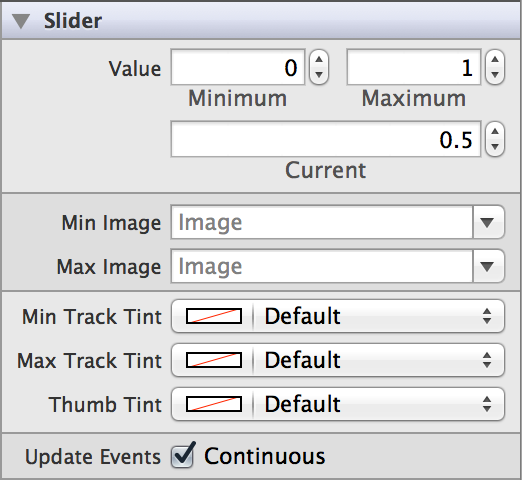
Configuration. Configure sliders in Interface Builder, in the Slider section of the Attributes Inspector. A few configurations cannot be made through the Attributes Inspector, so you must make them programmatically. You can set other configurations programmatically, too, if you prefer.

Content of Sliders
You can configure a minimum, maximum, and current value for your slider. By default, a slider’s minimum is set to 0, its maximum is set to 1, and its current value is set to 0.5. You can change these values by adjusting the Minimum (minimumValue), Maximum (maximumValue), and Current (value) fields in the Attributes Inspector.

Behavior of Sliders
Sliders do not need a delegate to function properly; their parent view controller can define their behavior without implementing any delegate protocols.
A slider sends the UIControlEventValueChanged event when the user interacts it. You can respond to this event by performing some corresponding action in your app, such as adjusting music volume. You register the target-action methods for a slider as shown below.
[self.mySlider addTarget:selfaction:@selector(myAction:)forControlEvents:UIControlEventValueChanged];
Alternatively, you can Control-drag the slider’s Value Changed event from the Connections Inspector to the action method. For more information, see Target-Action Mechanism.
You can specify when a slider’s UIControlEventValueChanged events are sent by toggling the Continuous (continuous) checkbox in the Attributes Inspector. In continuous delivery, the slider sends multiple value changed events as the user moves the thumb. In noncontinuous delivery, the slider sends one value changed event when the user releases the thumb. Continuous control event delivery is enabled by default.

Appearance of Sliders
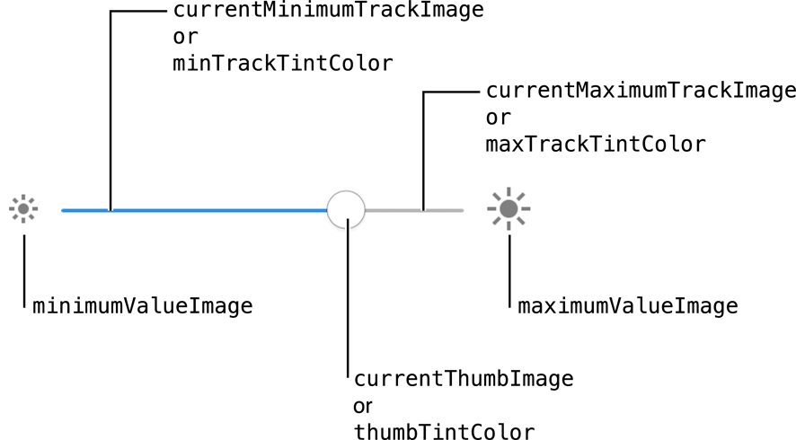
You can customize the appearance of a slider by setting the properties depicted below.

To customize the appearance of all sliders in your app, use the appearance proxy (for example, [UISlider appearance]). For more information about appearance proxies, see Appearance Proxies.
Minimum and Maximum Value Images
The most common way to customize the slider’s appearance is to provide custom minimum and maximum value images. You can set a slider’s minimum and maximum value images in Interface Builder by selecting custom images in the Min Image (minimumValueImage) and Max Image (maximumValueImage) fields in the Attributes Inspector.

These images sit at either end of the slider control and indicate which value that end of the slider represents. For example, a slider used to control volume might display a speaker with no sound waves emanating from it for the minimum value and display a speaker with many sound waves emanating from it for the maximum value, as illustrated here.

Tint Color
You can also set custom tints for each part of a slider. The minimum track image contains a blue highlight by default, while the maximum track and thumb images contain a white highlight. You can assign different tints for all of the standard parts provided by the slider. This can be done in the Attributes Inspector by setting the Min Track Tint (minimumTrackTintColor), Max Track Tint (maximumTrackTintColor), and Thumb Tint (thumbTintColor) fields.

Note that you can only adjust the tint of the default track and thumb images, not custom images. Setting the tint of a part of the slider that has custom images associated with it will remove those images.
Track and Thumb Images (Programmatic)
Slider controls draw the track using two customizable images. The region between the thumb and the end of the track associated with the slider’s minimum value is drawn using the minimum track image. The region between the thumb and the end of the track associated with the slider’s maximum value is drawn using the maximum track image. Different track images are used to provide context as to which end contains the minimum value. You can customize their appearance by assigning different pairs of track images to each UIControlState of the slider. Assigning different images to each state lets you customize the appearance of the slider when it is enabled, disabled, highlighted, and so on.
Use stretchable images for the slider’s track to create custom track images of any arbitrary width. You can create a stretchable image by using the UIImage method resizableImageWithCapInsets:. Use this method to add cap insets to an image or to change the existing cap insets of an image. During scaling or resizing of the image, areas covered by a cap are not scaled or resized. Instead, the pixel area not covered by the cap in each direction is tiled, left-to-right and top-to-bottom, to resize the image. For best performance, use a single-pixel image.
You can also customize the appearance of the thumb. Like the track images, you can assign different thumb images to each control state of the slider. To use a custom thumb image, add the image you wish to use to your Xcode project, and use it to create a UIImage. Use this UIImage to programmatically set the thumb image for your slider, as shown here. The same steps apply for the track images.
UIImage *thumbImage = [UIImage imageNamed:@"custom_thumb.png"];[self.mySlider setThumbImage:thumbImage forState:UIControlStateNormal];
Track and thumb images can only be customized programmatically, as there is no process for accomplishing this task in the Attributes Inspector.
Using Auto Layout with Sliders
You can create Auto Layout constraints between a slider and other user interface elements. You can create any type of constraint for a slider besides a baseline constraint.
To keep a slider centered and adjust its width according to device orientation or screen size, you can use Auto Layout to pin it to its superview. Using the Auto Layout “Pin” menu, create “Leading Space to Superview” and “Trailing Space to Superview” constraints and set their values equal to each other. Doing this ensures that the endpoints of your slider are a specified distance from the edges of its superview. With these constraints, the slider stays centered and its width adjusts automatically for different device orientations and screen sizes.
For general information about using Auto Layout with iOS controls, see Using Auto Layout with Controls.
Making Sliders Accessible
Sliders are accessible by default. The default accessibility traits for a slider are User Interaction Enabled and Adjustable.
When enabled on a device, VoiceOver speaks the accessibility label, value, traits, and hint are spoken back to the user. VoiceOver speaks this information when a user swipes up and down (not left and right) over the slider. For example, using the Ringer and Alerts volume slider (Settings > Sounds > Ringer and Alerts), VoiceOver speaks the following:
"Sound volume: 13 percent. Adjustable. Swipe up or down with one finger to adjust the value."
For general information about making iOS controls accessible, see Making Controls Accessible.
Internationalizing Sliders
Sliders have no special properties related to internationalization. However, if you use a slider with a label, make sure you provide localized strings for the label.
For more information, see Internationalization Programming Topics.
Debugging Sliders
When debugging issues with sliders, watch for these common pitfalls:
Specifying conflicting appearance settings. When customizing slider appearance with images or tint, use one option or the other, but not both. Conflicting settings for track and thumb appearance will be resolved in favor of the most recently set value. For example, setting a new minimum track image for any state clears any custom tint color you may have provided for minimum track images. Similarly, setting the thumb tint color removes any custom thumb images associated with the slider.
Selecting an out of range value. If you try to programmatically set a slider’s current value to be below the minimum or above the maximum, it is set to the minimum or maximum instead. However, if you try to do this using Interface Builder, the behavior is much different. For example, let's say your slider has a minimum value of 0, a maximum value of 5, and the current value is set to 1. If you change the current value to 999, the maximum value for the slider automatically changes to 999 because that value is higher than the maximum value, so Interface Builder adjusts accordingly.
Not setting custom images for every control state. If you use custom track and thumb images for your slider, remember to set an image for every possible
UIControlState. Any control state that does not have a corresponding custom image assigned to it will display the standard image instead. If you set one custom image, make sure to set them all.
Elements Similar to a Slider
The following elements provide similar functionality to a slider:
Switch. A control that represents an on/off toggle button. You should use a switch instead of a slider when you want to give users a choice between two opposing, discrete options instead of a range of values. For more information, see Switches.
Stepper. A control that uses a set of two buttons for incrementing or decrementing a value. You should use a stepper instead of a slider when you want to give users very precise control over the value of an element. For more information, see Steppers.
Copyright © 2014 Apple Inc. All rights reserved. Terms of Use | Privacy Policy | Updated: 2013-12-16


