Date Pickers
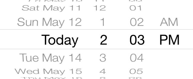
A date picker is a control used for selecting a specific date, time, or both. It also provides an interface for a countdown timer, although it does not implement the functionality. Date pickers provide a straightforward interface for managing date and time selection, allowing users to specify a particular date quickly and efficiently.

Purpose. Date pickers allow users to:
Specify a particular date and/or time
Use a countdown timer interface
Implementation. Date pickers are implemented in the UIDatePicker class and discussed in the UIDatePicker Class Reference.
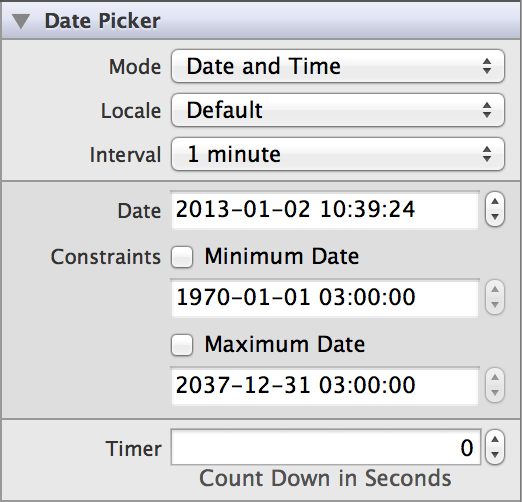
Configuration. Configure date pickers in Interface Builder, in the Date Picker section of the Attributes Inspector. A few configurations cannot be made through the Attributes Inspector, so you must make them programmatically. You can set other configurations programmatically, too, if you prefer.

Content of Date Pickers
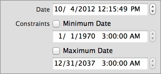
A date picker’s currently selected time displays at the center of the picker. This value defaults to the time the picker object was created, but you can adjust this value using the Date (date) field in Attributes Inspector. Use the Minimum Date (minimumDate) and Maximum Date (maximumDate) fields to constrain the date picker’s range. For example, if you are asking the user to input a birthday, you might set the maximum date to the current year. Creating a date scope that aligns with your picker’s intended functionality simplifies the user’s task of finding and setting the correct date.

When a date picker is in the countdown mode, you can use the Timer (countDownDuration) field to specify the seconds from which the countdown timer should count down. This value is ignored if the date picker is not in UIDatePickerModeCountDownTimer mode. Note that even though the timer shows a countdown in seconds, a user can only specify minute intervals to count down from.

Behavior of Date Pickers
Date pickers do not need a delegate to function properly; their parent view controller can define their behavior without implementing any delegate protocols.
A date picker sends the UIControlEventValueChanged event when the user finishes rotating one of the wheels to change the date or time. You can respond to this event by performing some corresponding action in your app, such as updating the time for a calendar event. You register the target-action methods for a date picker as shown below.
[self.myDatePicker addTarget:selfaction:@selector(myAction:)forControlEvents:UIControlEventValueChanged];
Alternatively, you can Control-drag the date picker’s Value Changed event from the Connections Inspector to the action method. For more information, see Target-Action Mechanism.

The most important setting in determining a date picker’s functionality is its mode. A date picker’s mode determines what content it displays to the user, as well as how it behaves. There are four mode settings: date and time, date only, time only, or countdown timer. The date and/or time modes allow users to select a specific point in time. The countdown timer allows users to specify a relative time period until an event occurs. You can specify one of these options using the Mode (datePickerMode) field in Attributes Inspector.
You can choose a specific locale for your date picker to appear in by adjusting the “Locale” (locale) field. For more information, see Internationalizing Date Pickers.
You can also specify the interval at which the date picker displays minutes. A smaller interval gives users more precise control over selecting a date picker time. Choose an interval in the Interval (minuteInterval) field.
Appearance of Date Pickers
You cannot customize the appearance of date pickers.
Using Auto Layout with Date Pickers
You can create Auto Layout constraints between a date picker and other user interface elements. You can create any type of constraint for a date picker besides a baseline constraint.
Date pickers usually reside at the bottom of the screen in all device orientations. Select “Bottom Space to Superview” and set the relation equal to 0 for the date picker to pin to the bottom of the screen in all device orientations.
For general information about using Auto Layout with iOS controls, see Using Auto Layout with Controls.
Making Date Pickers Accessible
Date pickers are accessible by default. Each rotating wheel in the date picker is its own accessibility element and has the “Adjustable” (UIAccessibilityTraitAdjustable) trait.
The accessibility value, traits, and hint for each picker wheel are spoken back to the user when VoiceOver is enabled on a device. VoiceOver speaks this information when a user taps on a picker wheel. For example, when a user taps the hours column on the Add Alarm page (Clock > Alarm > Add), VoiceOver speaks the following:
"2 o'clock. Picker item. Adjustable. Swipe up or down with one finger to adjust the value."
For general information about making iOS controls accessible, see Making Controls Accessible.
Internationalizing Date Pickers
Date pickers handle their own internationalization; the only thing you need to do it specify the appropriate locale. You can choose a specific locale for your date picker to appear in by setting the “Locale” (locale) field in Attributes Inspector. This changes the language that the date picker is presented in, but also the format of the date and time (for example, certain locales present days before month names, or prefer a 24-hour clock over a 12-hour clock). The width of the date picker automatically accommodates for the length of the localization. To use the system language, leave this property to default.
For more information, see Internationalization Programming Topics.
Debugging Date Pickers
When debugging issues with date pickers, watch for these common pitfalls:
Specifying conflicting date bounds. Check the bounds of your
minimumDateandmaximumDate. If the maximum date is less than the minimum date, both properties are ignored. The minimum and maximum dates are also ignored in the countdown-timer mode (UIDatePickerModeCountDownTimer).Selecting an incorrect interval. Check that the
minuteIntervalcan be evenly divided into 60; otherwise, the default value is used (1).
Elements Similar to a Date Picker
The following element provides similar functionality to a date picker:
Picker View. A class like the date picker that can be used for selecting things other than date and time. For more information, see Picker Views.
Copyright © 2014 Apple Inc. All rights reserved. Terms of Use | Privacy Policy | Updated: 2013-12-16


