Switches
A switch lets the user turn an option on and off. You see switches used throughout the Settings app to let a user quickly toggle a specific setting.


Purpose. Switches allow users to:
Choose between two mutually exclusive options
Quickly toggle an option on and off
Implementation. Switches are implemented in the UISwitch class and discussed in the UISwitch Class Reference.
Configuration. Configure switches in Interface Builder, in the Switch section of the Attributes Inspector. A few configurations cannot be made through the Attributes Inspector, so you must make them programmatically. You can set other configurations programmatically, too, if you prefer.

Content of Switches
Specify a switch’s state to indicate whether the switch is initially on or off. The default value is on. Use the State (on) field in the Attributes Inspector to accomplish this task.

Behavior of Switches (Programmatic)
Switches do not need a delegate to function properly; their parent view controller can define their behavior without implementing any delegate protocols.
A switch sends the UIControlEventValueChanged event when the user toggles it. You can respond to this event by performing some corresponding action in your app, such as turning a setting on or off. You register the target-action methods for a switch as shown below.
[mySwitch addTarget:selfaction:@selector(myAction:)forControlEvents:UIControlEventValueChanged];
Alternatively, you can Control-drag the switch’s Value Changed event from the Connections Inspector to the action method. For more information, see Target-Action Mechanism.
Appearance of Switches
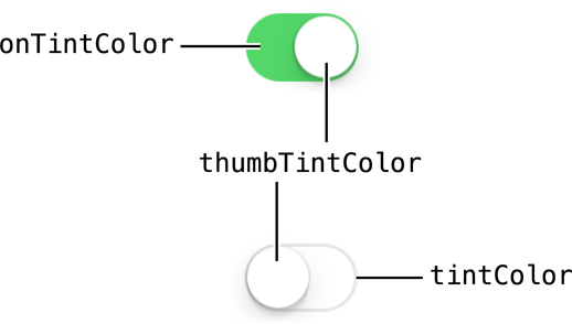
You can customize the appearance of a switch by setting the properties depicted below.

To customize the appearance of all switches in your app, use the appearance proxy (for example, [UISwitch appearance]). For more information about appearance proxies, see Appearance Proxies.
Tint Color
A switch’s on tint can be configured in the On Tint (onTintColor) field in Attributes Inspector. This is the color you see when a switch is in the on position. The default on tint is green.

Thumb tint and off tint can only be configured programmatically. By default, the thumb tint is white and can be set using the thumbTintColor property . You can also set a custom off tint using the tintColor property. The off tint is light gray by default, but will inherit its superview’s tint color if a custom one is set. For more information, see Tint Color.
self.mySwitch.thumbTintColor = [UIColor blueColor];self.mySwitch.tintColor = [UIColor redColor];
Using Auto Layout with Switches
Switches need a label to tell the user what they are for. To label a switch, drag a label out of the elements library. Make a bottom alignment constraint between their baselines, and a horizontal space constraint between them of standard size.
For general information about using Auto Layout with iOS controls, see Using Auto Layout with Controls.
Making Switches Accessible
Switches are accessible by default. A switch’s default accessibility traits are Button and User Interaction Enabled.
Switches are typically used in a table cell. When a table cell with a switch is tapped, VoiceOver speaks the cell name, state of the switch, and hint are spoken back to the user. For example, when a user taps the Invert Colors switch (Settings > General > Accessibility), VoiceOver speaks the following:
Invert Colors. Off. Double tap to toggle setting.
For general information about making iOS controls accessible, see Making Controls Accessible.
Internationalizing Switches
Switches have no special properties related to internationalization. However, if you use a switch with a label, make sure you provide localized strings for the label.
For more information, see Internationalization Programming Topics.
Debugging Switches
When debugging issues with sliders, watch for these common pitfalls:
Setting on/off images that are the wrong dimensions. A switch does not scale or stretch any custom images that you add to it. For example, if you specify an on image that is smaller than the switch, you will see the switch’s on tint color in the space that’s not covered by the image. On the other hand, if you specify an on image that is too big, it can bleed over into the space intended for the off image. The size of on/off images should be 77 points wide and 27 points tall.
Specifying conflicting appearance settings. When customizing switch appearance with images or tint, you can use one option or the other, but not both. Custom images appear on top of the tint layer. While you may think you are adjusting the tint of the image itself, you’re simply setting the tint for a layer that is not visible under the image.
Elements Similar to a Switch
The following element provides similar functionality to a switch:
Slider. A control that allows users to make adjustments to a value within a range of value. You should use a slider instead of a switch when you want to let users select from a range of values instead of giving them a choice between two opposing, discrete options. For more information, see Sliders.
Copyright © 2014 Apple Inc. All rights reserved. Terms of Use | Privacy Policy | Updated: 2013-12-16


